Hotels should consider these points when choosing a website theme

Each day more people go online to book their holidays, which is why those days when people used to book holidays over the phone are long gone.
On the other hand, having an online presence is not enough for hotels. This is because you must impress and persuade potential guests to book in the first few seconds when it comes to choosing accommodation and they access your hotel’s website. At this point, hotels should take the right decisions in terms of theme selections and button redirections by benefiting from the influence and power of marketing in the most proper way when building their website.
Hotels should consider these significant tips on buttons and redirections that work for website theme selection and practical use of widgets.
The loading speed of pages
As Google now includes speed as a criterion to qualify top ranking, it is critical for your hotel’s website to load in a few seconds. Also, if your hotel’s webpage loads faster, you will achieve a significant advantage in standing out amongst your competitors. This is because potential guests generally don’t want to wait for a page or an image on your website to load.
To achieve this, you can minimize flash elements on your site or you may at least avoid using such elements in sections that include critical information. Also, you can boost your page- and image-loading speed by creating a simple yet effective theme and minimizing the number and length of site content.
Determining a core goal and proposal
It is crucial for a hotel to ensure that its website’s theme and sales offer communicate its very message to the potential guests in a few seconds. At this point, adopting a clear goal and avoiding a complex style of language might help you express your commitment to your potential guests easily. So, it is important to make sure that your potential guests navigate through your site’s pages without any hustle and easily make bookings through your home page. Also, if your potential guests have a question or problem regarding booking, they should be able to see your phone number on your home page to call your hotel.
If you want to provide a clear commitment for your potential guests, you had better minimize your content. Therefore, you should also display the prices when announcing the number of available rooms. You must use high-quality, high-definition and attractive colors in the sections featuring booking options for these rooms. You will in turn reap high return rates and a handsome profitability if your site content is simple and clear. Otherwise, you will lose your potential guests.
Use of effective images
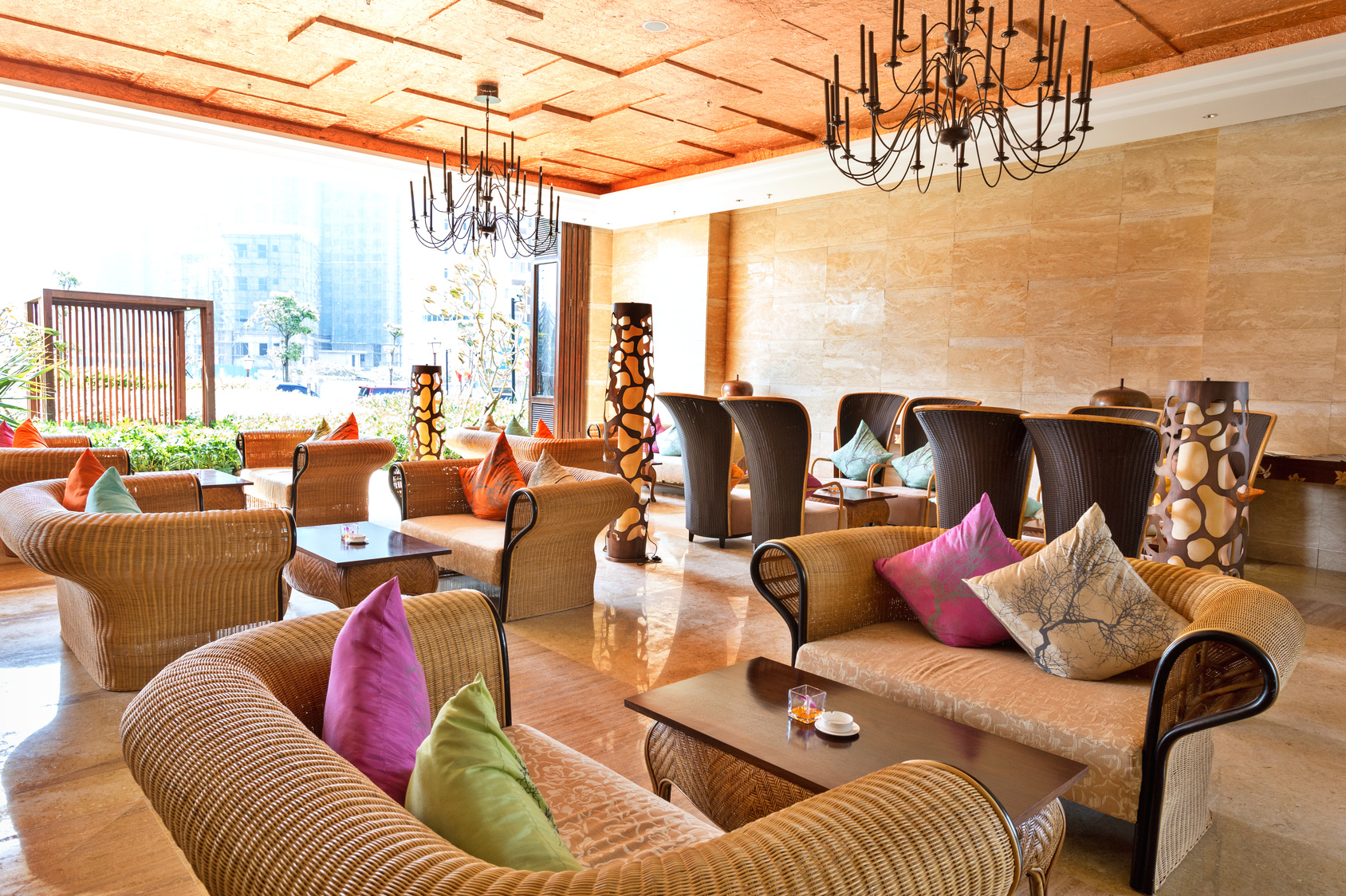
If you use attractive, high-definition and large images on your hotel’s website, it might evoke a sophisticated and outstanding impression. At this point, you should make sure that all the images of your hotel bolster your hotel up. For instance, you may use photos of guests stayed in your hotel before if you have a small-scale boutique hotel targeting a distinct group of guests. As a general and practical rule, however, you had better use images reflecting the competitive opportunities in your hotel. This is because you will in turn highlight the different features of your hotel more effectively. In addition, your images should be bright enough, clear, high-quality and high-definition to create a similar kind of emotional impact.
You may utilize our tips and make your hotel’s website more attractive and interesting. HotelRunner is always there for you not only by supporting your website with images, effective backgrounds and templates, but also by helping you claim your position across the digital realm. Create your free HotelRunner account now and start benefiting from its advantages.


